


Description
What our Interpreting Graphs lesson plan includes
Lesson Objectives and Overview: Interpreting Graphs introduces students to the concept of and uses for graphs. This interactive lesson equips students to identify different types of graphs, interpret graphs, and create graphs using the given data. At the end of this lesson, students will be able to identify different types of graphs, interpret graphs, and create graphs using the given data. This lesson is for students in 4th grade, 5th grade, and 6th grade.
Classroom Procedure
Every lesson plan provides you with a classroom procedure page that outlines a step-by-step guide to follow. You do not have to follow the guide exactly. The guide helps you organize the lesson and details when to hand out worksheets. It also lists information in the blue box that you might find useful. You will find the lesson objectives, state standards, and number of class sessions the lesson should take to complete in this area. In addition, it describes the supplies you will need as well as what and how you need to prepare beforehand. The supplies that you will need for this lesson include colored pencils, rulers, graph or plain white paper, compasses, and the handouts.
Options for Lesson
Included with this lesson is an “Options for Lesson” section that lists a number of suggestions for activities to add to the lesson or substitutions for the ones already in the lesson. One optional adjustment to this lesson is to use the Homework page as in-class assignment or the Practice page for homework. You can also assign your students a question to use for the homework assignment. Finally, you could teach each of your students to use Excel to create charts and graphs.
Teacher Notes
The teacher notes page includes a paragraph with additional guidelines and things to think about as you begin to plan your lesson. This page also includes lines that you can use to add your own notes as you’re preparing for this lesson.
INTERPRETING GRAPHS LESSON PLAN CONTENT PAGES
Interpreting Graphs
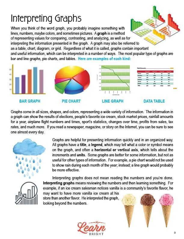
The Interpreting Graphs lesson plan includes three pages of content. The word graph likely calls to mind things like lines, numbers, and colors. We use graphs to represent values, or data, and to compare, contrast, and analyze it. We can also interpret graphs. Sometimes, we call graphs by other names, like table, chart, diagram, or grid. No matter what we call them, graphs contain important information that we can interpret in multiple ways. Bar and line graphs, pie charts, and tables are the most common types of graphs. The lesson shows an example of each of these types of graphs.
Graphs can be all different shapes, sizes, and colors. Graphs can show different kinds of information, from election results to people’s favorite ice cream flavors to stock market prices and more. Newspapers, magazines, and stories on the internet could all include one or more graph!
We use graphs to present information in an organized way that’s easy to interpret. All graphs must have titles and legends (which tell what different colors or symbols on the graph mean). Many graphs have horizontal and/or vertical axes (which give information about the increments used) and units. Different types of graphs are better for showing different types of information. For example, you would not use a pie chart to show how much it rained during each month of the year. A line graph would be a better choice to show that kind of information.
You might think that interpreting graphs just means reading the numbers, but that’s not true! When you interpret a graph, you review the numbers and draw a conclusion about them. For example, if an ice cream salesman looks at a graph of people’s favorite ice cream flavors and sees that vanilla is the most popular flavor, he may want to order more vanilla ice cream for his store. He looked beyond the numbers to draw a conclusion!
Example Graphs: Bar Graphs
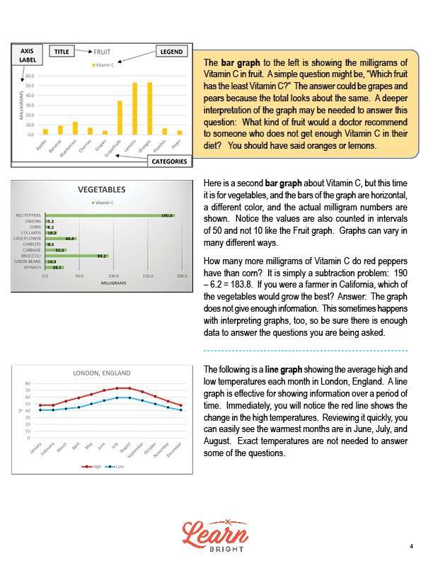
Next, the lesson shows some example graphs to show what kind of information they represent and what conclusions you can draw from them. First, the lesson includes a bar graph that shows the milligrams of Vitamin C in different fruits. A question that you can ask yourself as you look at this bar graph is “Which fruit has the least Vitamin C?”. When we look at the graph, we can see that it looks like both grapes and pears have the least.
Next, the lesson shows another bar graph, this time displayed horizontally, that shows Vitamin C in vegetables. Something to note about this graph is that intervals are different from the intervals used in the first bar graph. When looking at this bar graph, you can ask yourself how many more milligrams of Vitamin C red peppers have than corn. To figure this out, you look at the graph and subtract the milligrams of Vitamin C in corn from the milligrams of Vitamin C in red peppers.
Sometimes, there isn’t enough data to answer a question about a graph. You also might not have the right kind of information. For example, we could not answer the question “If you were a farmer in California, which of the vegetables would grow the best?” by looking at this bar graph.
Example Graphs: Line Graph
Next, the lesson includes an example line graph that shows the average high and low temperatures each month in London, England. Line graphs are good at showing information over time. Looking at this graph, you might notice the red line shows the average high temperatures and the blue line shows the average low temperatures. By taking a quick look at the graph, we can immediately tell that June, July, and August are the warmest months of the year in London. We don’t need exact temperatures to answer this question.
Example Graphs: Pie Chart
Finally, the lesson includes an example pie chart that shows local election results. Pie charts are a great way to compare percentages. The percentages in a pie chart must always add up to 100%. Some pie charts give you the exact percentage for each category, while others do not. The example pie chart does not, but we can still use it to estimate. Looking at the pie chart, we can estimate that Williams received about 33% of the vote, because his piece of the pie is about 1/3 of the total pie. We can also tell that Lincoln received the least amount of votes, because his piece of the pie is the smallest.
Conclusion
Always remember that some graphs are easy to read, while others require more analysis. You can analyze a graph in many different ways using estimation, determining a theory, or contrasting or comparing more than one graph or data given on a graph. Sometimes, the graph you’re looking at won’t have all of the information you need. When this happens, don’t just guess!
Creating and interpreting graphs can be a very helpful way of organizing, presenting, and identifying information and data. You can practice interpreting graphs whenever you see them!
INTERPRETING GRAPHS LESSON PLAN WORKSHEETS
The Interpreting Graphs lesson plan includes three worksheets: an activity worksheet, a practice worksheet, and a homework assignment. You can refer to the guide on the classroom procedure page to determine when to hand out each worksheet.
CREATING GRAPHS ACTIVITY WORKSHEET
The activity worksheet asks students to read three scenarios and create graphs for each. They will create one line graph, one bar graph, and one pie chart, determining which type of graph is best for each scenario. They should include all of the data from each scenario in each graph.
INTERPRETING GRAPHS PRACTICE WORKSHEET
For the practice worksheet, students will look at three different graphs and will answer ten questions about them.
SURVEY HOMEWORK ASSIGNMENT
The homework assignment asks students to survey 10-20 people using a question they create with four possible responses. They will write down their question and their four possible answers on the worksheet. As they ask people their question, they will write down their responses. They will then take that data and use it to create two graphs: a line or bar graph and a pie chart. Each graph must have a title and labels. They can include images and color if they’d like. Once they create their graphs, they will create three questions that another person will use to interpret their graphs.
Worksheet Answer Keys
This lesson plan includes an answer key for the practice worksheet. If you choose to administer the lesson pages to your students via PDF, you will need to save a new file that omits these pages. Otherwise, you can simply print out the applicable pages and keep these as reference for yourself when grading assignments.